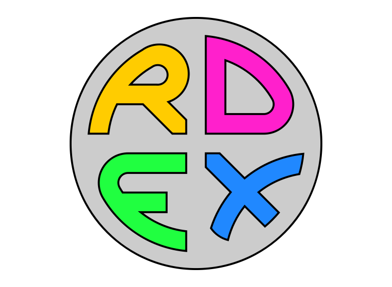
Designing a new rdex logo

The general consensus seemed to be that the old rdex logo was bad, so I designed a new one. In the process I discovered that things that are trivial on paper, seem to be incredibly difficult in Inkscape - but to be fair I suppose I only tried for 10 minutes before giving up and reverting to the method I shall now write a little about.
The new logo is drawn using only straight lines and circular arcs, with proportions based on small integers. Translating it into SVG was harder than I anticipated, mostly because there wasn't a tool combining the best parts of my Konstrukt with a proper friendly design package.
As a concrete example, constructing the D is specified like this:
- draw concentric circles of radius 8, 9, 11, and 13 units
- draw vertical lines 1 unit and 3 units to the right of the center
- draw horizontal lines 1 unit and 3 units above the center
- draw a line at 30 degrees above horizontal through the center
- where the 30-degree-line meets the radius-8 circle, draw concentric circles of 1 and 3 units
- fill and outline the D-shaped region, erasing the extra construction lines
Simple? I think so. But to translate to SVG required manually finding the coordinates of all the intersection points, which aren't nice round numbers despite the simple proportions. For example, the top left outside corner of the D has coordinates (1, 10.95445115...).
Calculating all these points becomes really really tedious, lots of scribbled equations and head-scratching, but then I remembered about Wolfram Alpha, a web service which can solve geometric equations (amongst other things). This sped up the process, but it would be nicer still to have the capability in a free software design program like Inkscape. Maybe the capability is already there and I just didn't look hard enough.